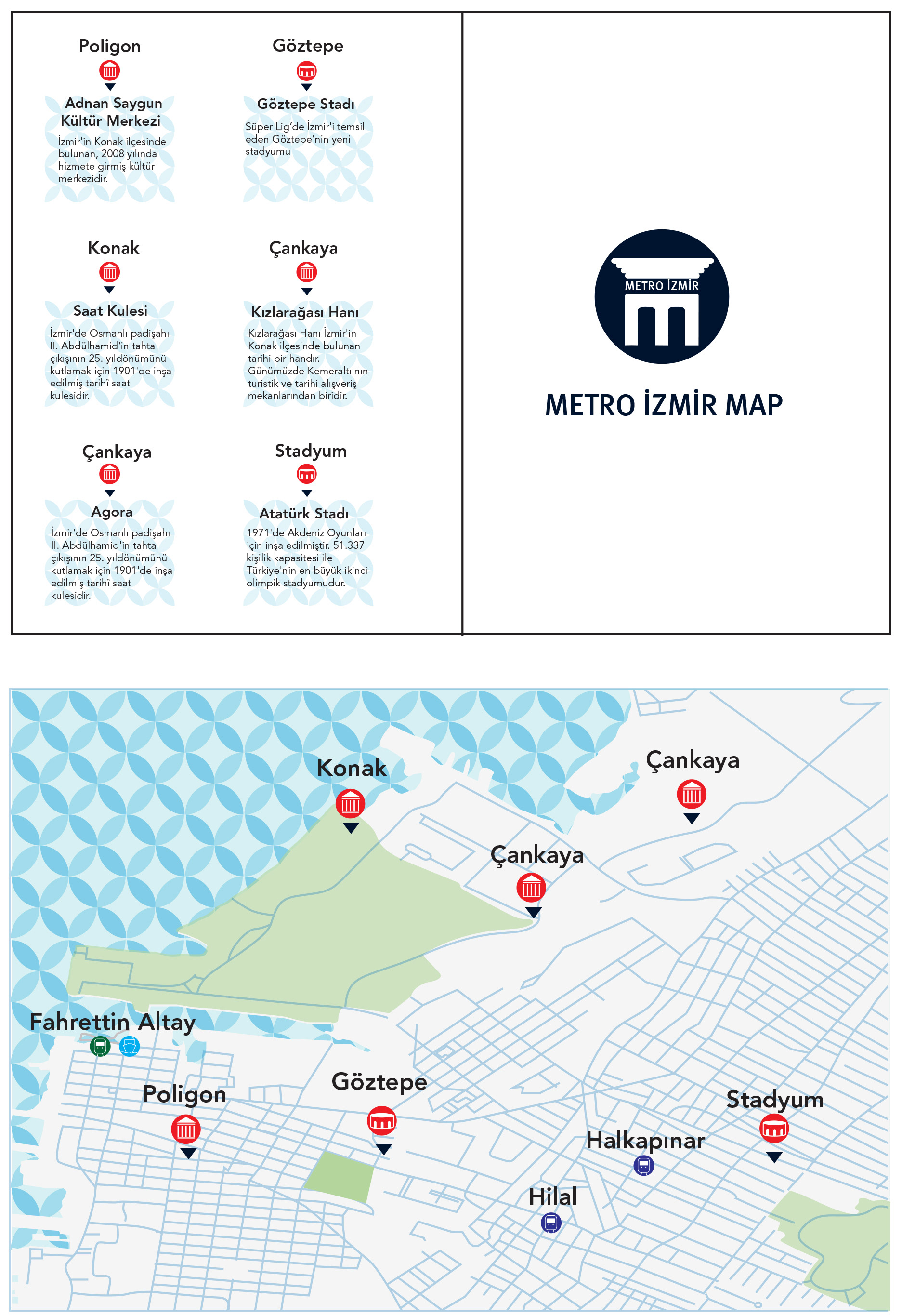
Izmir is a multi-cultured port city. The transportation of the city is provided by various transfers. Nowadays, metro is the one of the most prefer public transportation and people provide transportation to the desired point by metro.
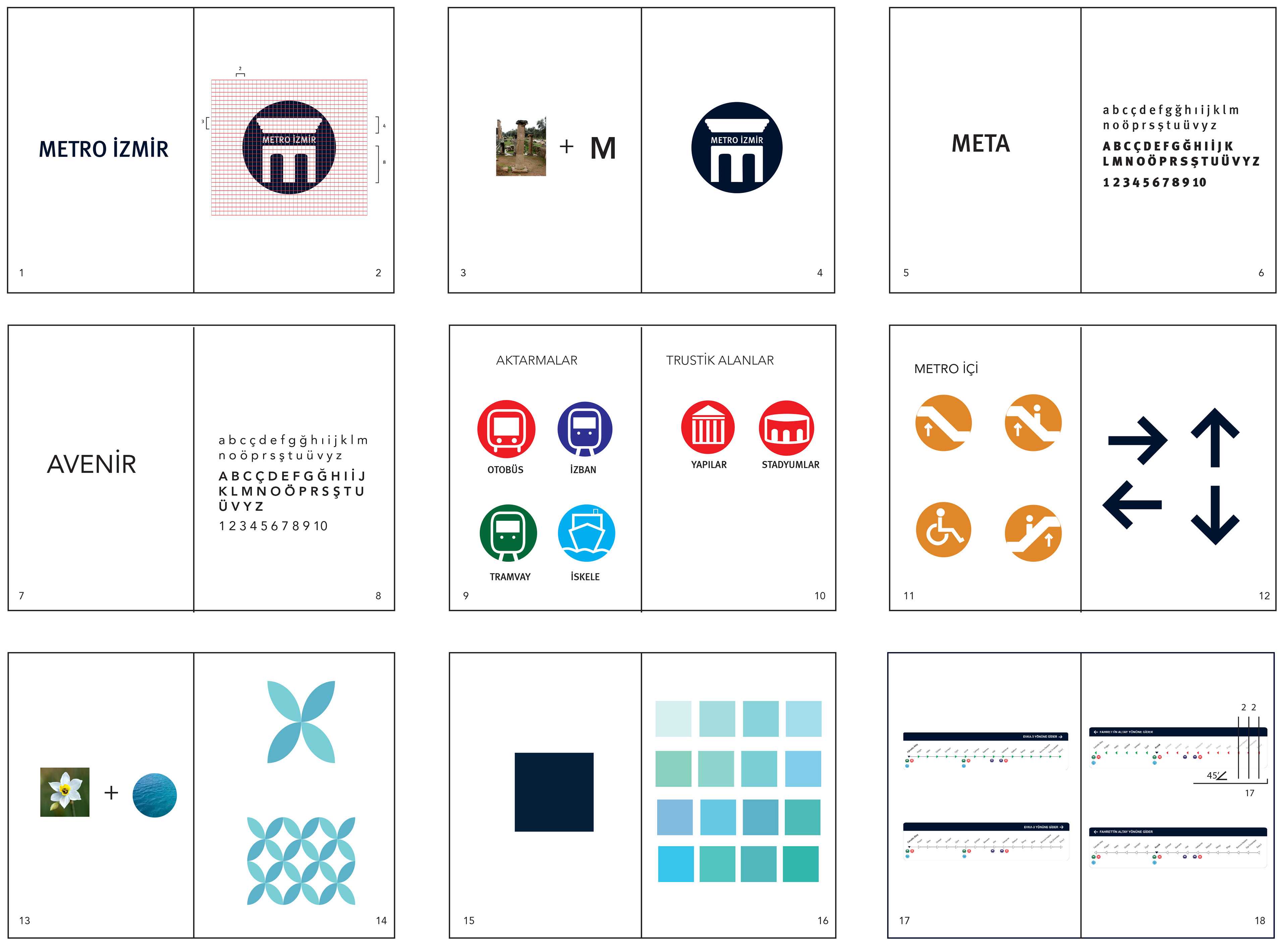
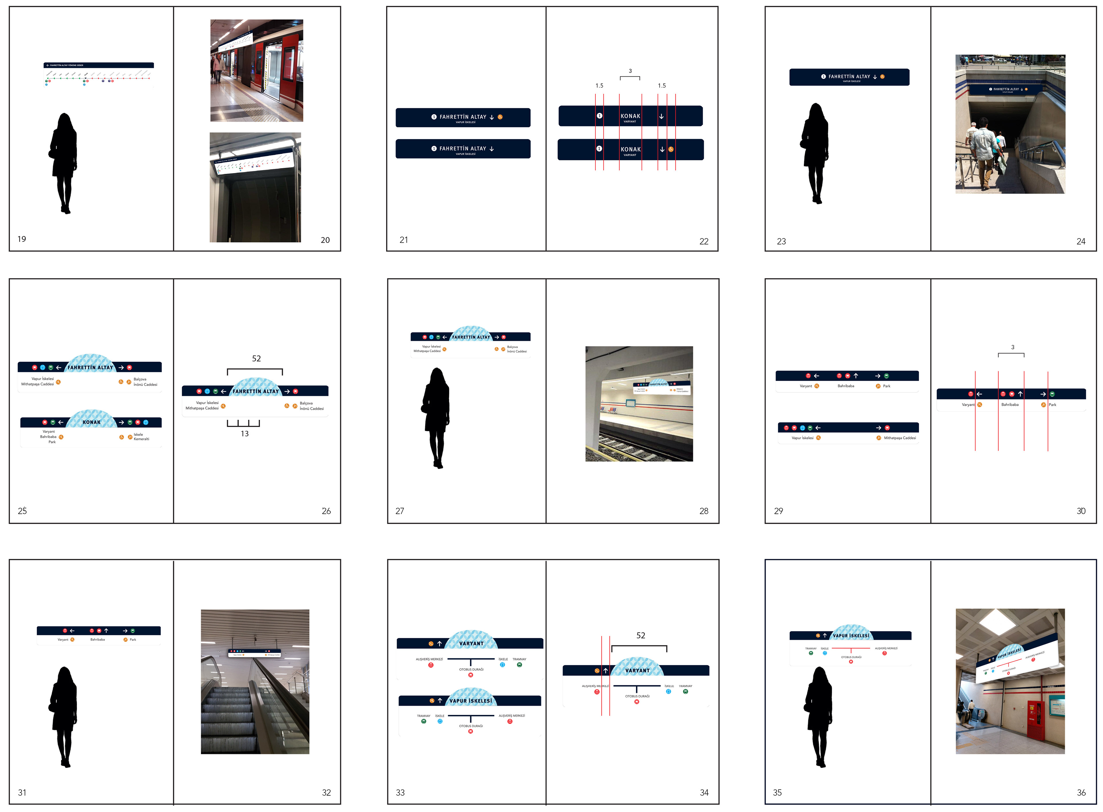
Izmir subway has 17 stations. There are various numbers of exits and transfer points in each station. Direction signs in the subway, do not direct the people to the desired point easily and it is insufficient to easily reach to the transfer points. Orientation signs have a complex form and it does not have a united layout.
In this project, I focused on the solution of these problems. It has its own logo, colour scale, unity, icon and directional signs. Now, Izmir Metro it has become a corporate identity of İzmir.
